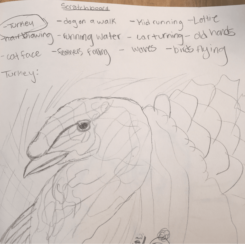
     1. Describe the subject matter and meaning of your artwork.
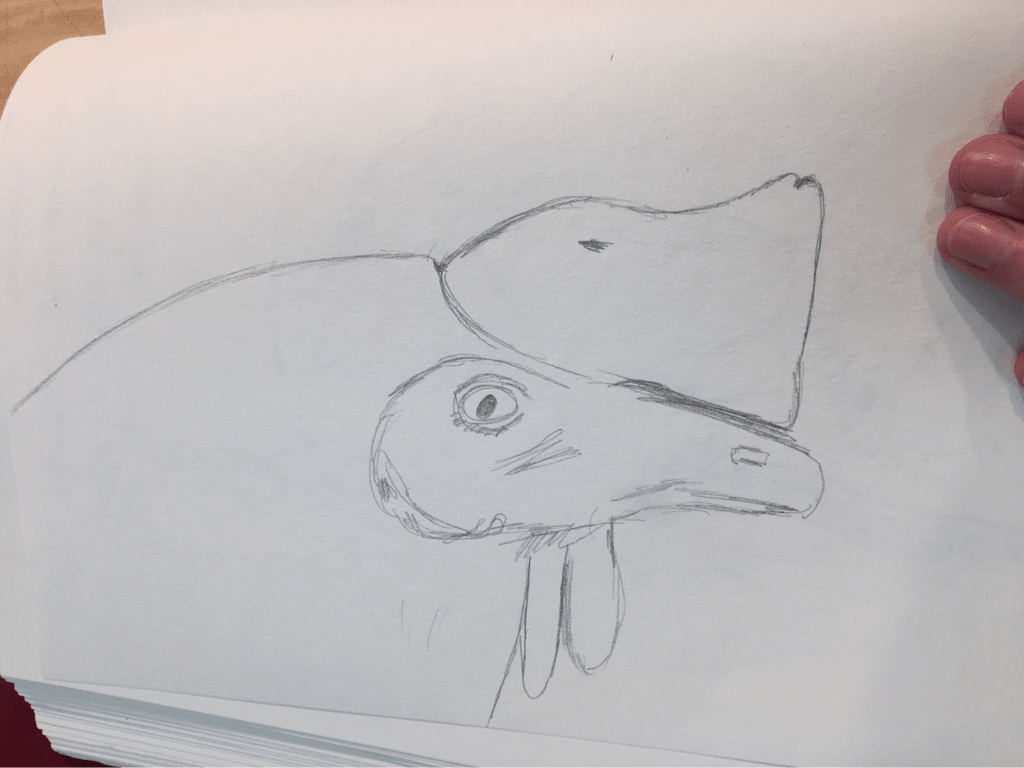
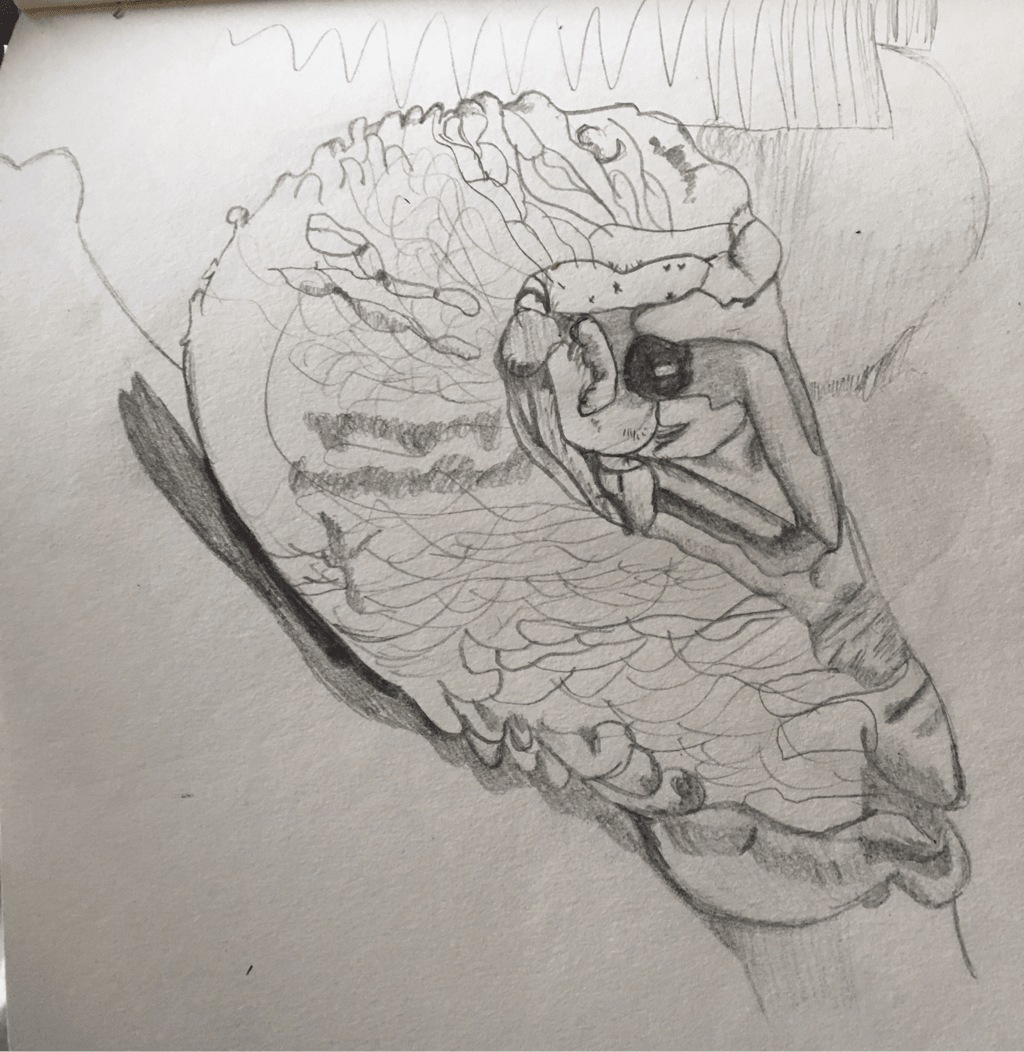
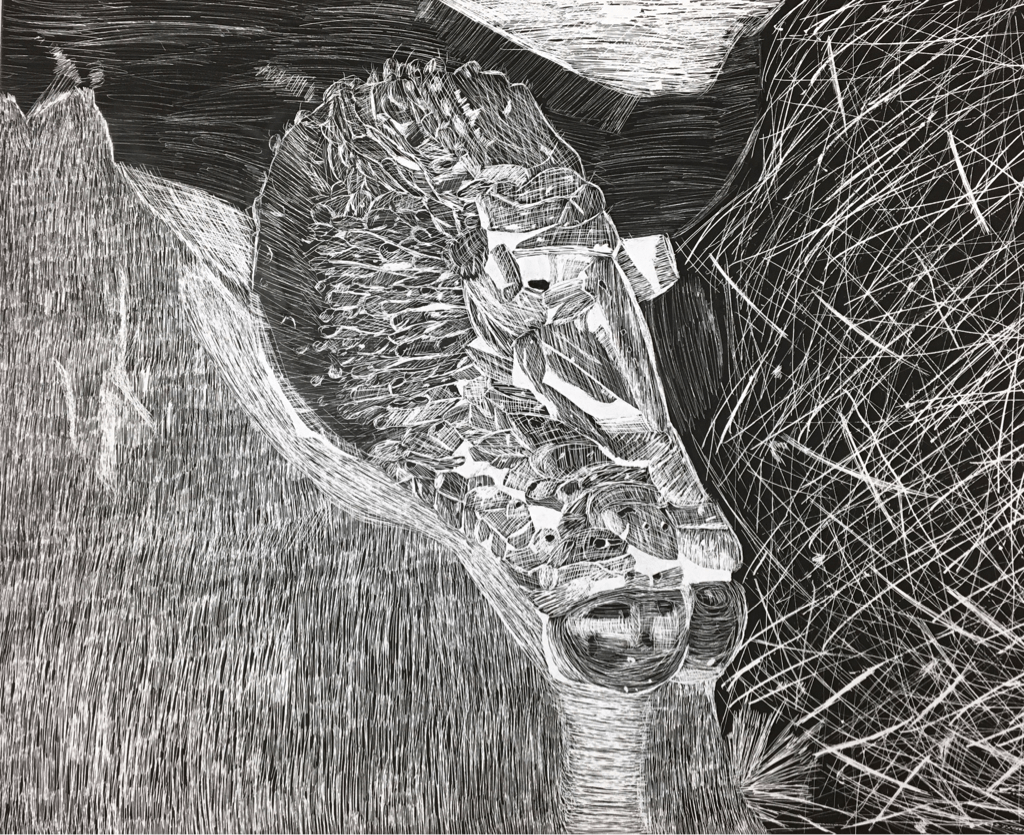
The subject matter of my artwork was a turkey. I chose a turkey because I think they are incredible and intelligent animals. They show so much affection and even climb in your lap. My dad took this photo of a turkey at the Piedmont Refuge Farm! Animals are a huge part of my life so that's why I chose to do a turkey. 2. How did you use textures to enhance your picture? You can see texture in the feathers. This was hard to show because the wings of the turkey were a little blurry and they were white. You can also see texture in the rubber on the turkeys neck. Each section of the rubbery texture had different values which I tried to show as best as I could. 3. How did you balance your artwork and create a well-organized composition? I think I did a good job creating a well organized composition. I think the turkey was a good size to create. The turkey takes up most of the scratchboard which was a little difficult to do with the proportions but I think it turned out well. 4. How did you imply movement in your drawing? I chose to focus on texture more than movement. . In the photo the turkey was just sitting there so there wasn't any movement going on. You could argue that the different shadows on the turkey showed that the sunlight was moving to different portions of the turkey. 5. How could you improve your artwork? I could've improved my artwork by not getting impatient with all the tiny details. I could've spaced my time better instead of finishing up the project in two days. 6. How did you demonstrate a wide range of shading values? I think I did a decent time of demonstrating shading values. The whiter sections of the turkey was where the photo had darker sections. In the rubbery part of the turkey, there were multiple different values that I think I showed well.
0 Comments
  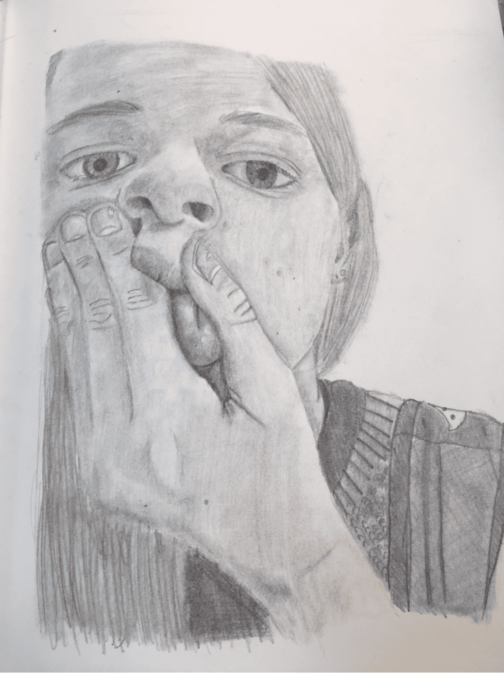 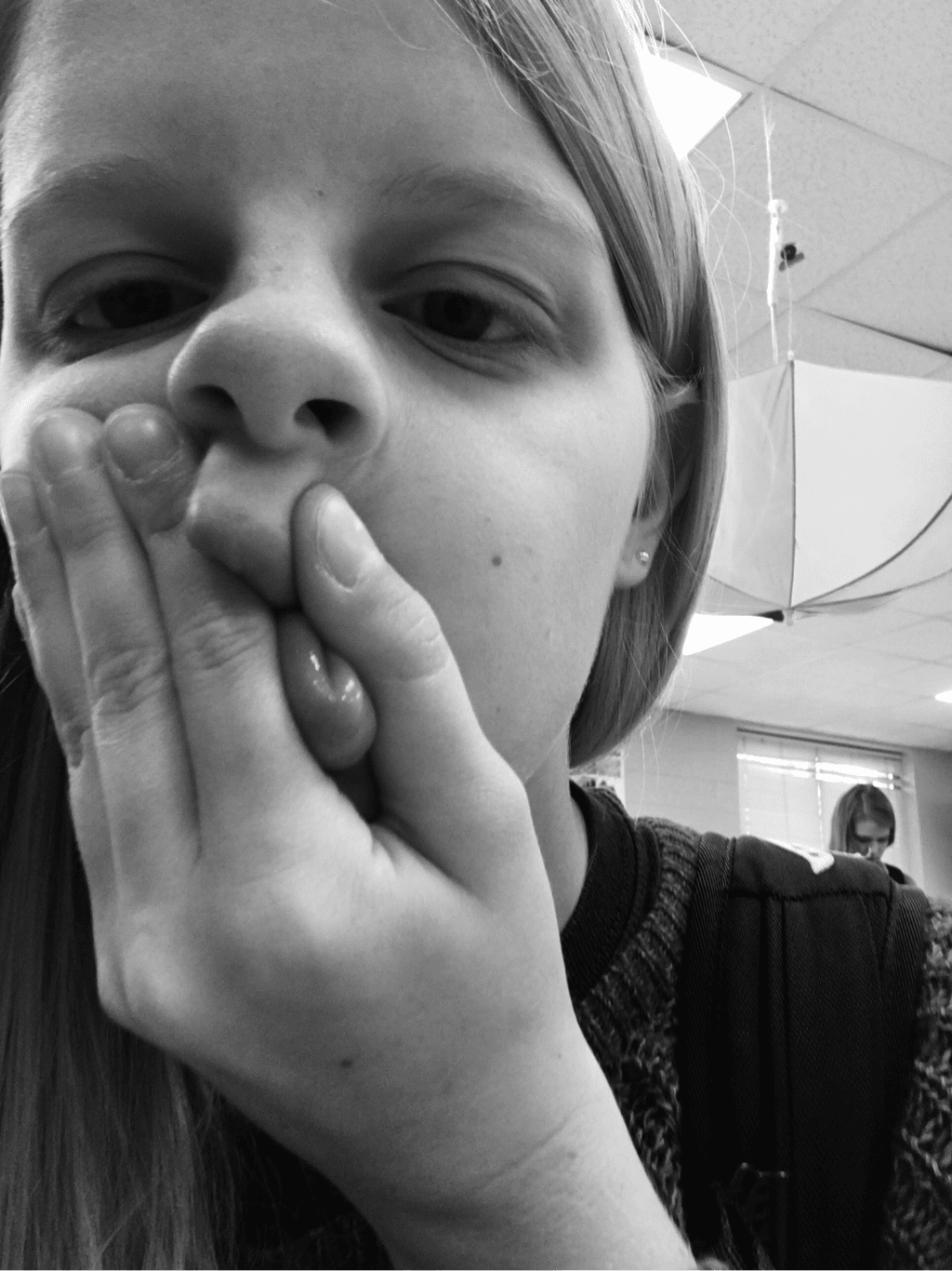   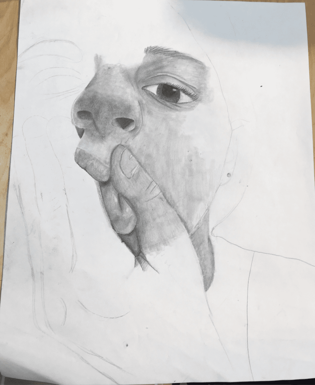 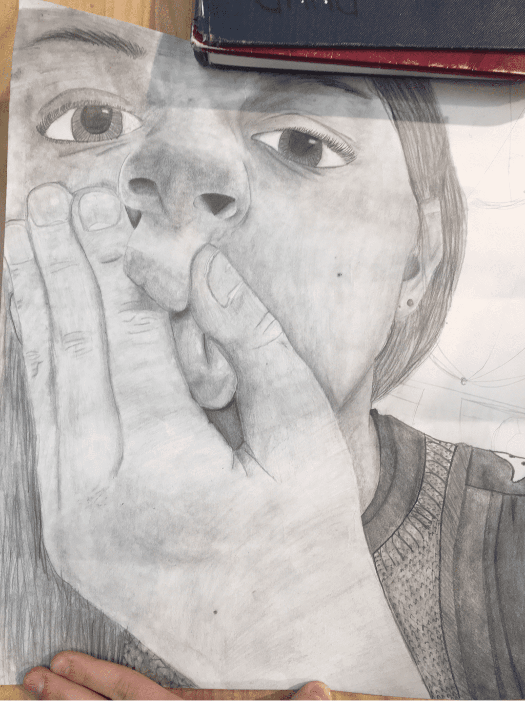 I drew a self portrait of me holding my lips together. I think I showed depth under my lips, in my nostrils, and in my ear. I showed value on the tip of my nose leading to the bridge. I had value in my sweater and bookbag.
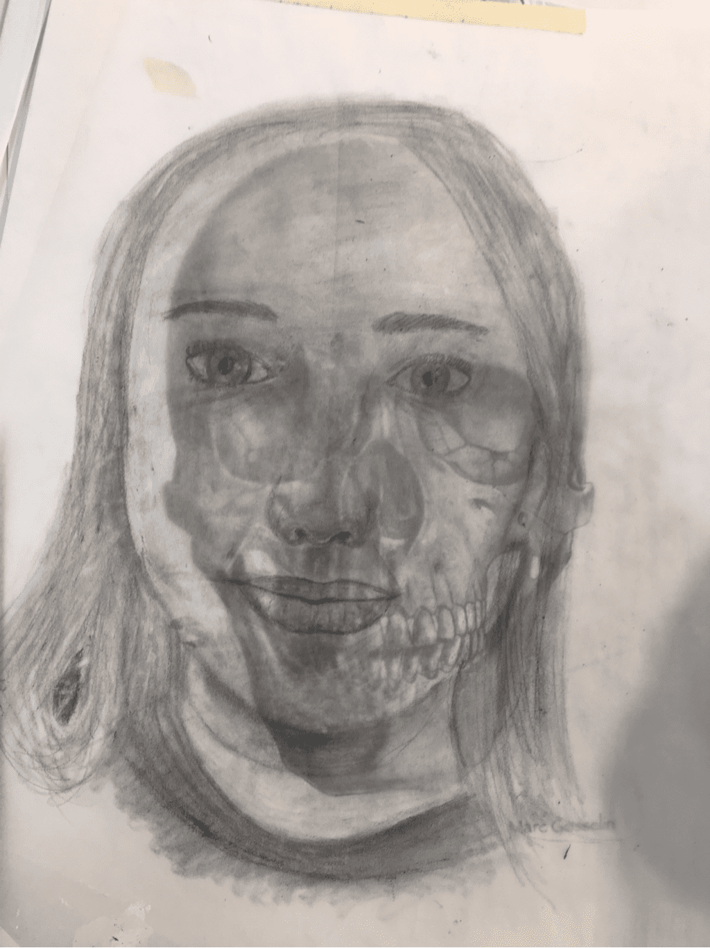
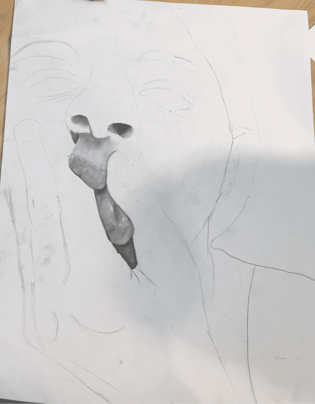
I chose this face because I knew I would enjoy drawing the lips. I think the most important aesthetic to my portrait is the nose. It is darker than my face which shows that the nose is coming forward. My drawing evokes expression because you can see that I'm holding my lips to make a face. You can't see a lot of feeling because in the photo I wasn't deliberately showing feeling. In the above photos, you can see the process I used to get to the final piece. 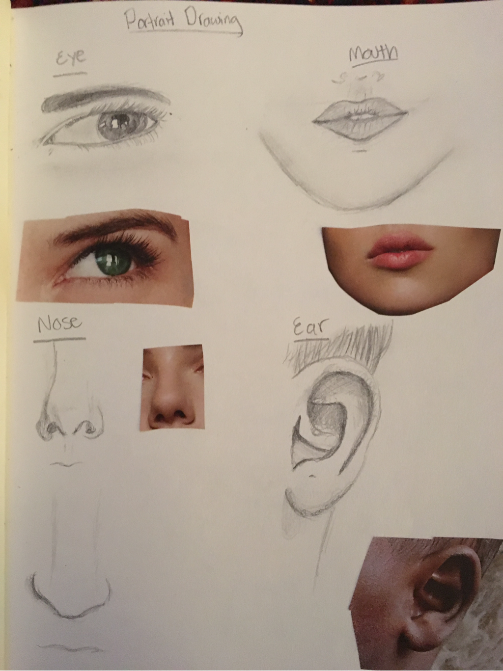 These are my drawings of magazine facial features. I think my favorite is the ear because I got the most value in it. I love the shape of the noses, but there is no value. I thought my mouth and eye looked good, but I can definitely tell that I've improved.  The top eye is my first eye, and the bottom is the second. I can definitely see that I improved a lot from the first eye. I have more variations of value. The highlights in the second eye look more natural as well as the eye lashes. I also think the shape of the eye looks better in the second one.  The left nose is a random nose, the middle and right are my nose. The shape in the left nose is definitely wonky. The nostrils are too big and the shading isn't well executed. I did a lot better on the middle nose, the the shading is too harsh. The right nose looks a lot like my nose. I love how the nostrils turned out. I think I should make the value lighter though.  The top image is my first pair of lips. I think overall I did okay, I think I need to blend the values more so it is not as harsh. The bottom lips I really love. The teeth don't look horrible, and I think the shape of the lips was fun to draw. 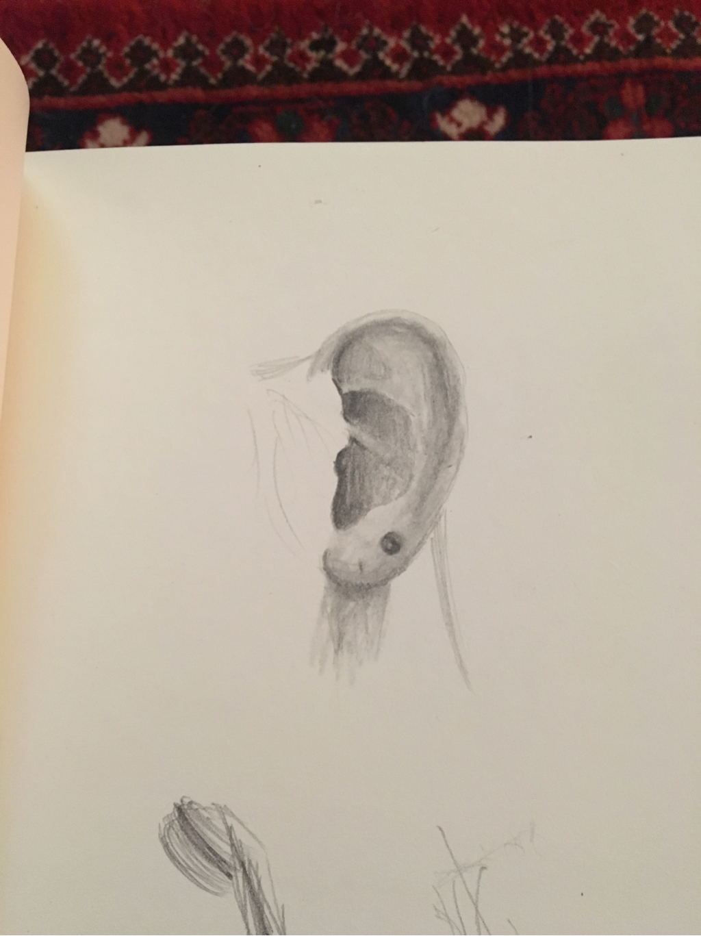 I LOVE how my ear turned out. I think the value could have more depth, but overall it looks good. I think it looks pretty realistic. I like how I did the piercing hole too. 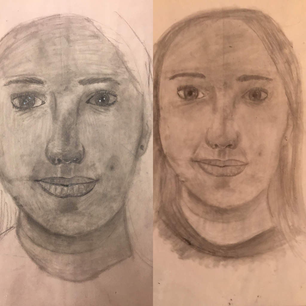 I am not a fan of my skull self portrait. I don't think it looks at all like me. The nose looks pretty good. I need to work on using different values and highlights.
  1. Describe the craftsmanship of your drawing. (Is it neat and well executed?)
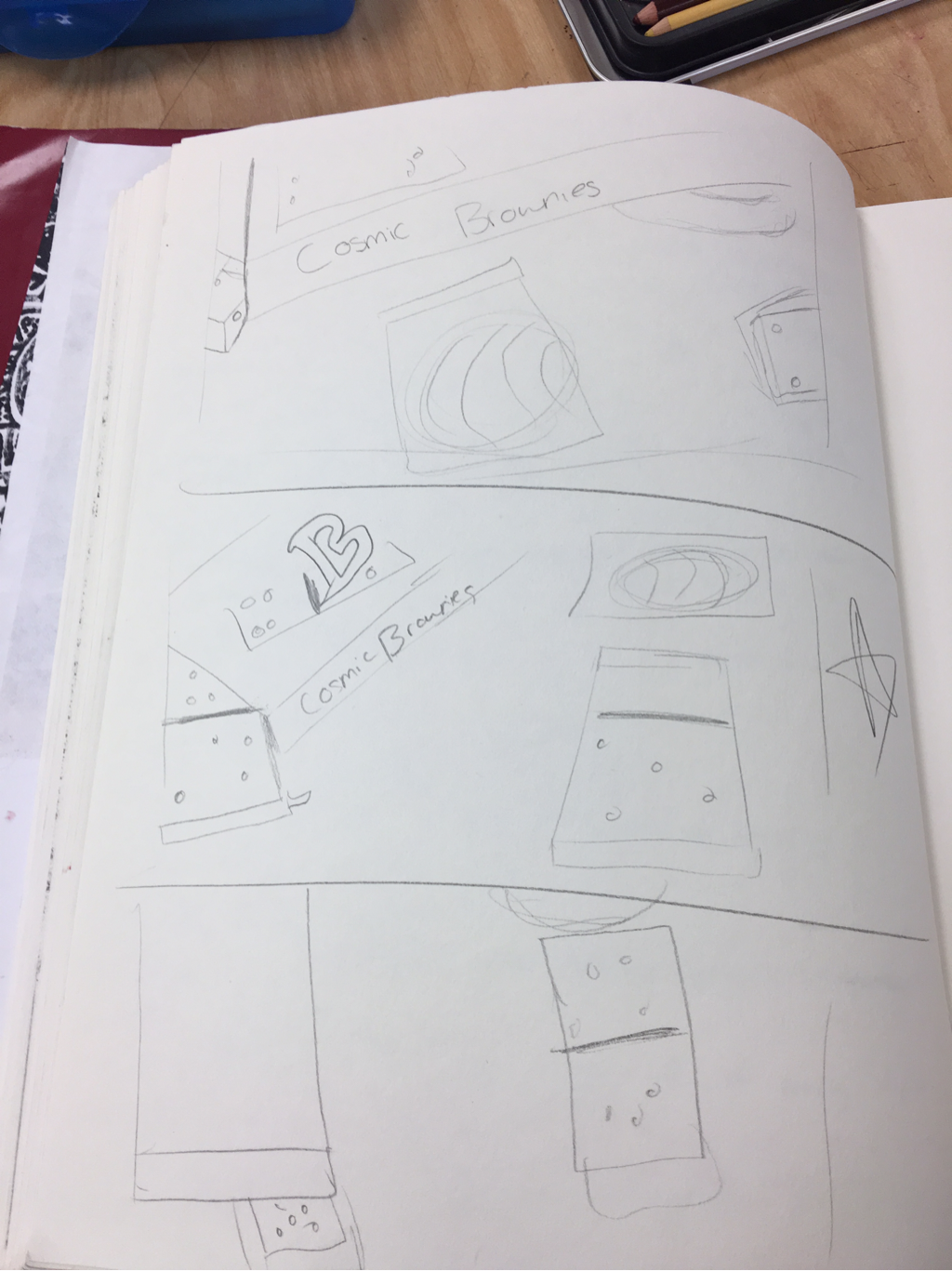
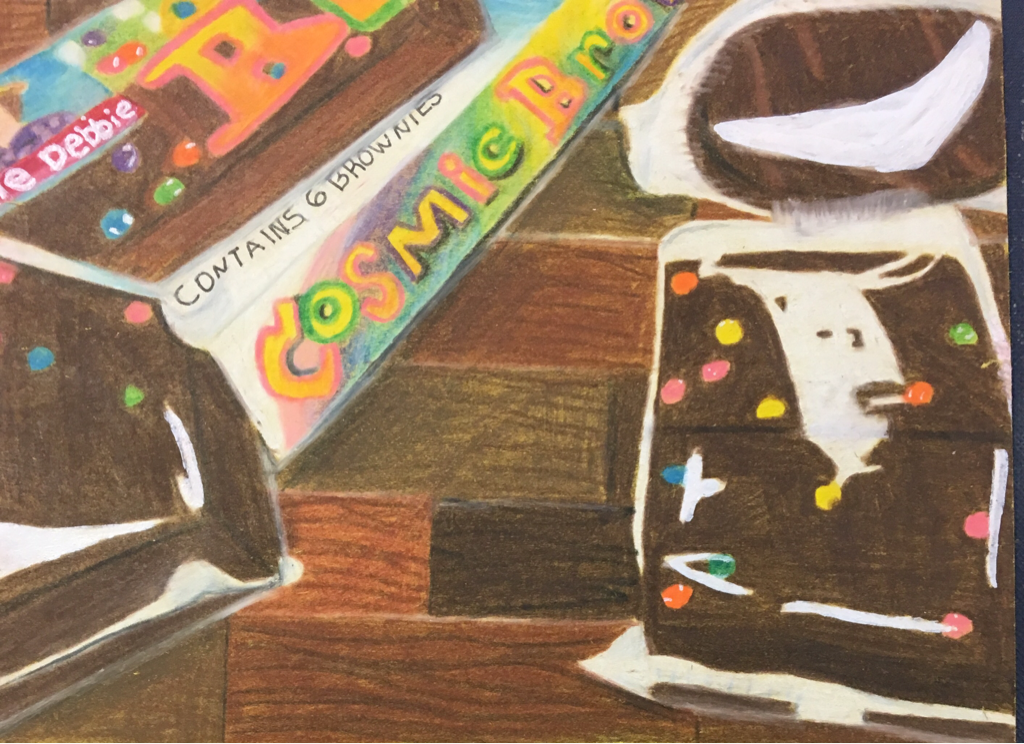
I really like how this project turned out. I was worried about doing the wrapper but I think I did a decent job. I like the colors on the box. I think it looks similar to the actual box. I really like how the highlights turned out. 2. Describe how your background choices help unify the three artworks and tie them together as one piece of art. I think doing hardwood floor was a smart choice because it ties in the colors of the brownies. I decided last minute to make the background a floor but I think I did a good job. The brownies stand out enough against the floor so it doesn't blend in. There are a good amount of bright colors and a good amount of dark colors. 3. Describe your choice of colors/color harmonies and how you used them throughout the artwork. I think the background ties the brownies together. I was worried about the floor overpowering the brownies, but I don't think it did. The box turned out better than I thought it would. The colors on the box stand out really well against the darker background. The candy on the brownies are really bright too. 4. How did you create contrast in your drawing? I created contrast with the brownies and the candy bits on the brownie. The brownie is really dark and the candy is really bright so it creates contrast. The box has many bright colors which create contrast against the hardwood floor. The bright white wrapper and highlights stand out against the brownies. 5. How did you use textures, highlights and shadows to enhance your artwork? I didn't use too many texture, but I did use a lot of highlights. On the candy on the brownies, I put little white highlights on them to show how smooth and bright they were. I used highlights on the wrappers too to make them stand out. I used light shadows under the box to show the box was standing up. 6. Why did you choose a particular background color to mount your artwork? I chose yellow paper because I thought it would make the brown colors brighter. I think it did work. I used a brown colored background to tie the colors of the brownie together. 7. Discuss the importance of understanding the media (prisma or pastels) and acquiring the skills necessary to create a successful project. In order to make a successful piece, you need to know how to use Prismacolor. If I didn't know the basics of the prismas, I wouldn't have been able to blend browns together in the floor. I wouldn't know what colors would be compatible. It's also important to know how to create opacity using a white pencil against dark browns. 8. Describe any difficulties you had creating your drawing and what you could do to improve your drawing? I had difficulty deciding what I wanted to do with the background. I am happy with my choice thought. I could've made my piece bigger. Next time I would work more on the little details of the wrapper. I would spend more time on little details. 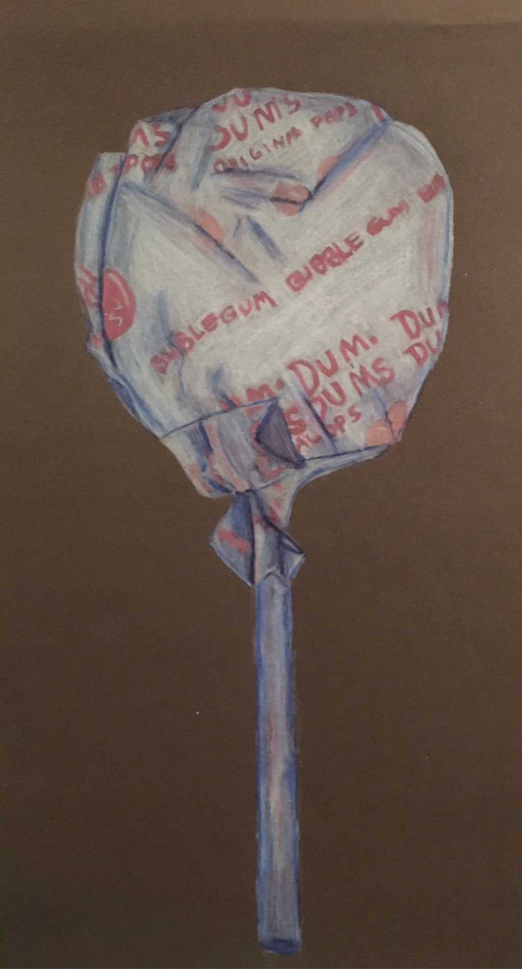 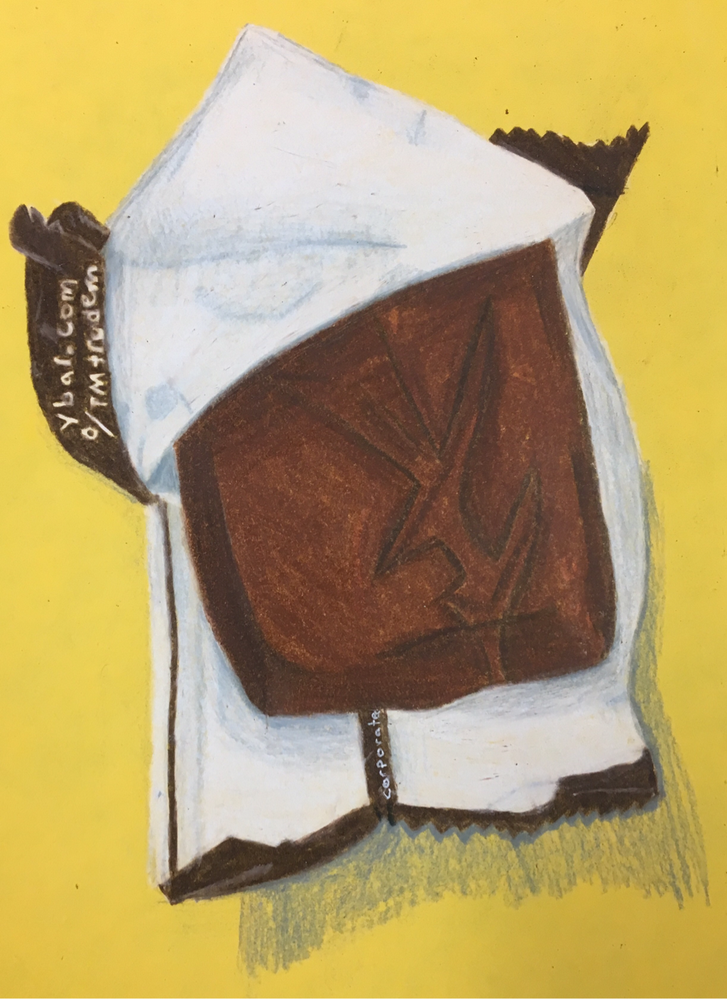 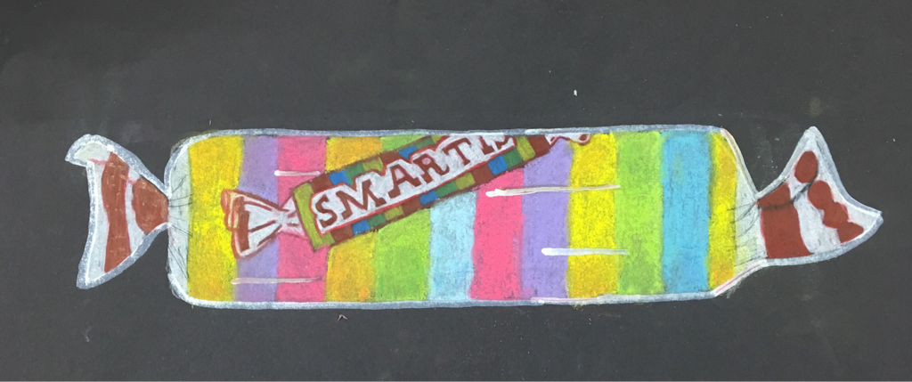 I really like how the dum dum turned out. I think the wrinkles in the paper were well executed. I like the color choices I used. I think the shadows were well executed too.
I like how the candy bar turned out for the most part. I wish I could have made it more 3 dimensional. I like the composition and how the wrapper is open. I think my favorite part is the wrapper. I did not enjoy using chalk pastels. I did not like the consistency of the chalk and how messy it was. I think the colors were too vibrant. I like how the ends of the wrapper and the logo turned out.  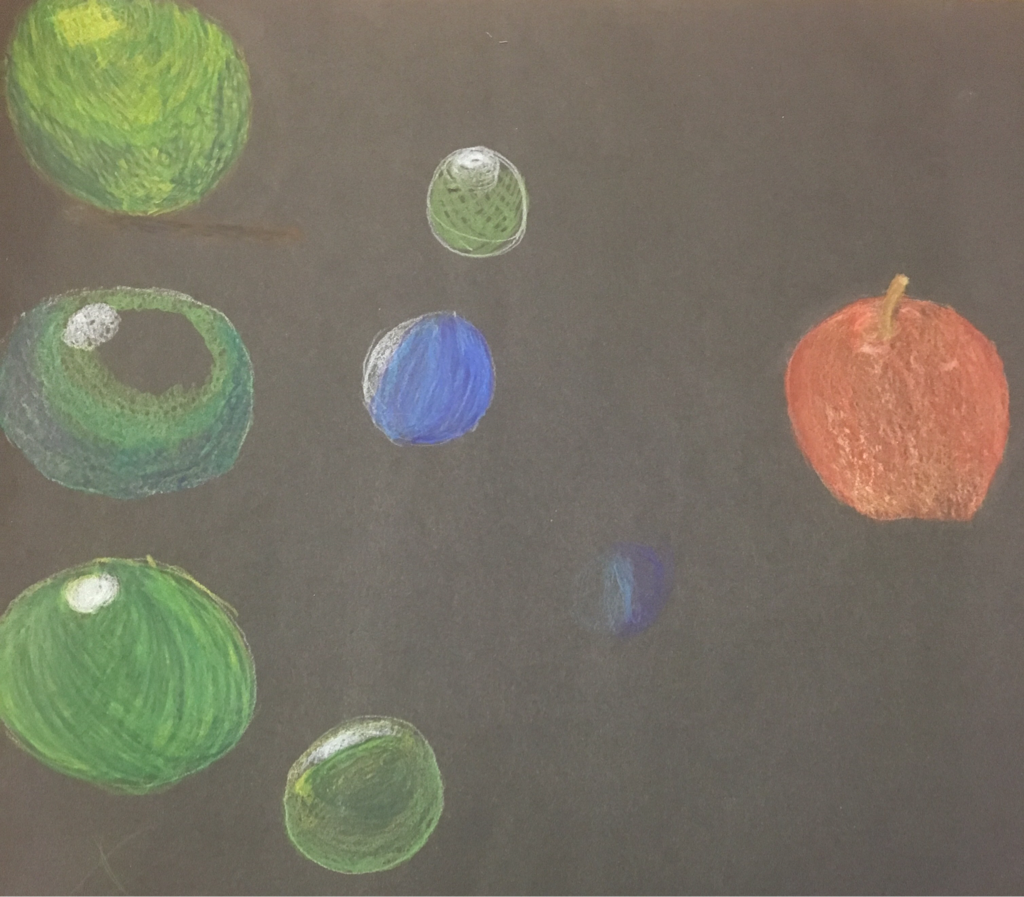 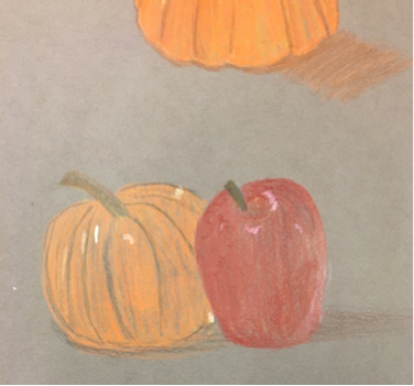 Above are my practice with colored pencils. 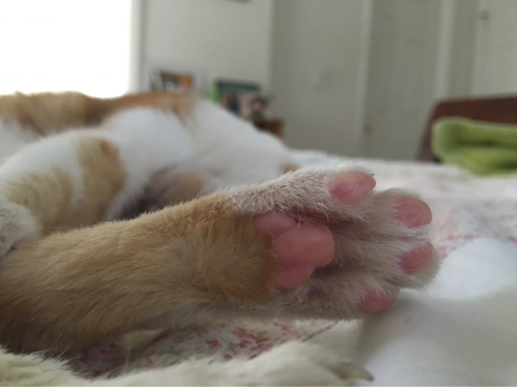 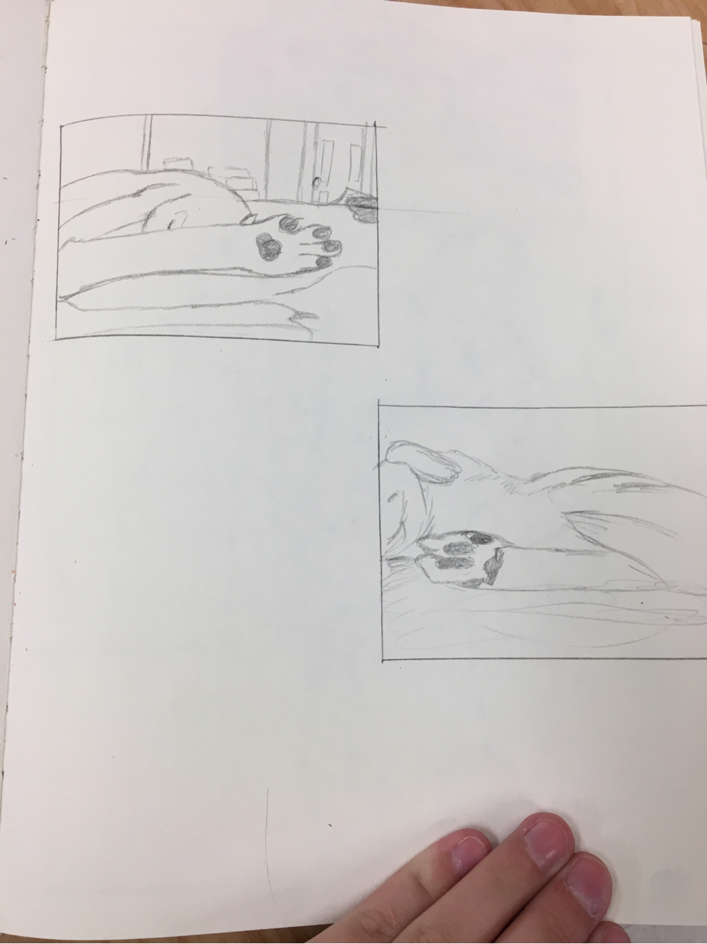 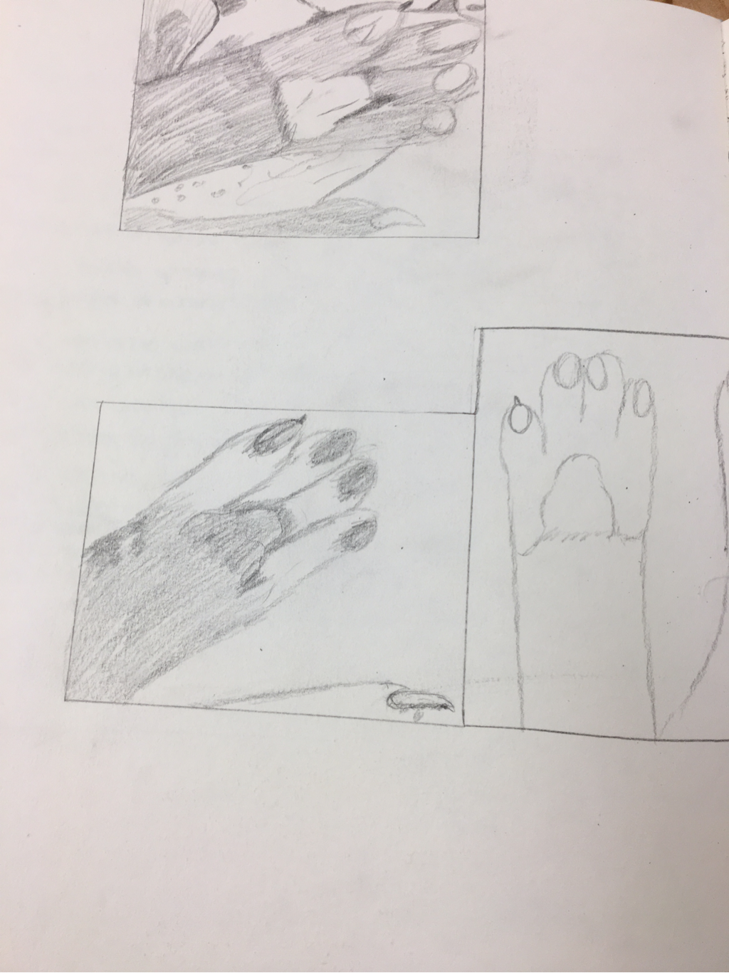 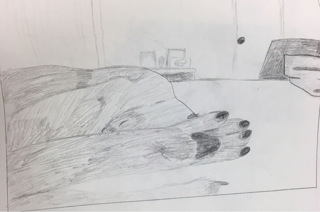 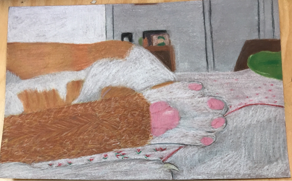 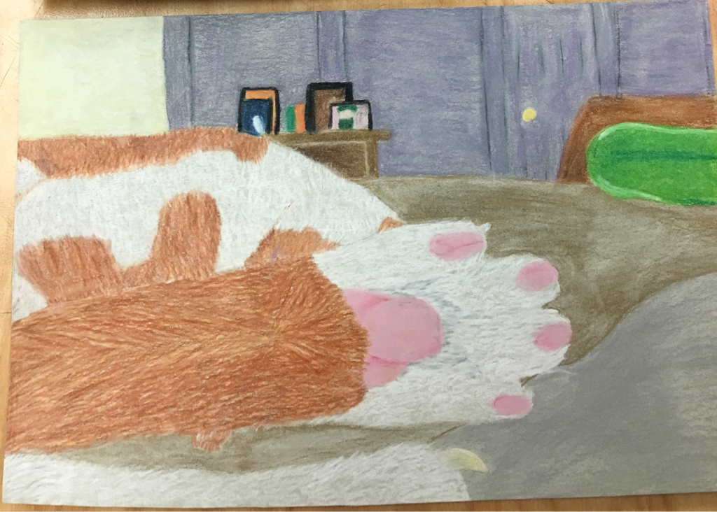 Above is my sketches of my cat's paws and the bottom photo is my final project. 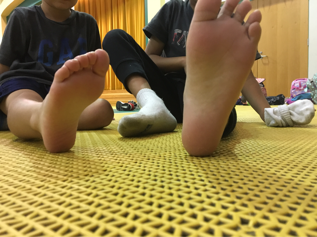 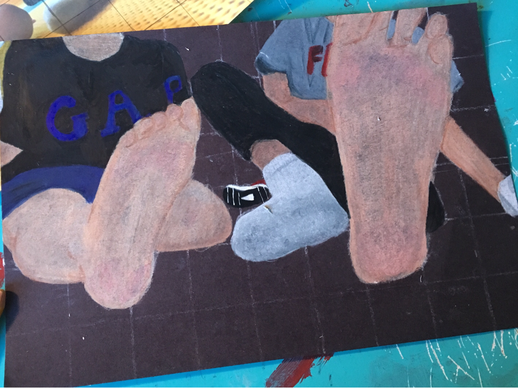 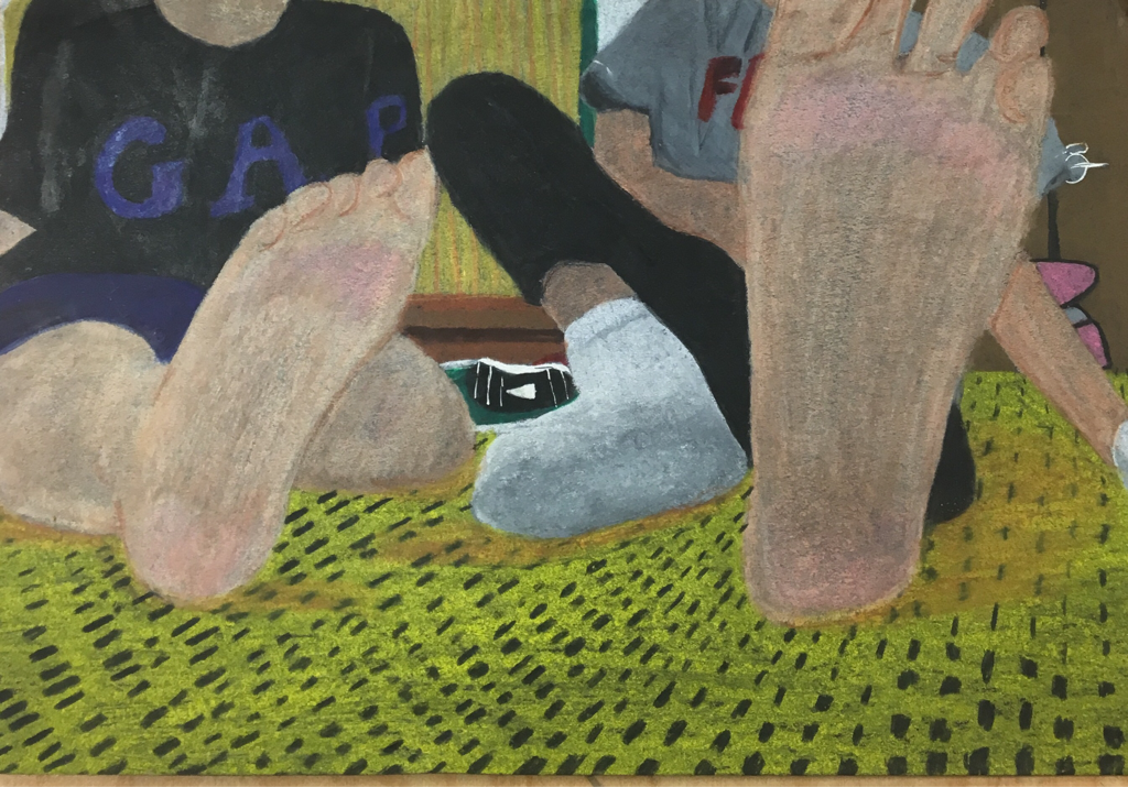 1. Describe how you created an interesting point of view? Was it successful? Why or why not?
For the drawing of the feet, I think I created an interesting point of view. The feet are up close so they are large, then the legs get smaller and smaller because they're further away. For the paws, it's the same. The pad of the paws are bigger than the body. 2. Why is it important to understand perspective and how to draw it? It is important because the drawing will be in the right proportion if the perspective is correct. If you don't understand perspective, you will not get the depth needed in the drawing. You need to know where the drawing gets bigger and smaller. 3. How were the colored pencil exercises important in the success of your piece? They were important because it taught you how to mix the colored pencils. You learned what colors would come after the other. Also what colors would be compatible together. 4. Describe the craftsmanship of your colored pencil. What techniques were used? (How well the project is technically crafted). I used a lot of straight lines rather than the circular motion. I like how the paws turned out because I mixed a lot lf colord together to get the fur. Using skin tones was a new struggle for me in the drawing of the feet but I think I overall did well. 5. Were you able to achieve depth by showing a foreground, middle ground and back- ground? Explain. I think so. In my drawing of the feet, you saw the stage, shoes in the back, and the feet. In the paws, you see the pictures, bed frame, and paws. 6. Explain your experience with colored pencil and the project in general. What were the obstacles and advantages? I overall liked the colored pencils. It is more precise than using markers or charcoal. I struggled with putting enough layers on and mixing the colors together. 7. Looking back on the progression of this project what skills, techniques or other information would you like to have been taught? Do you feel you were prepared for this project? i would've liked to be taught more about blending colors together so lines wouldn't show. I think I was prepared for this project. 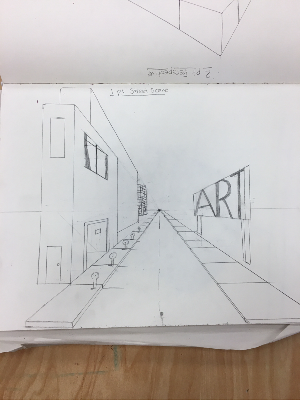 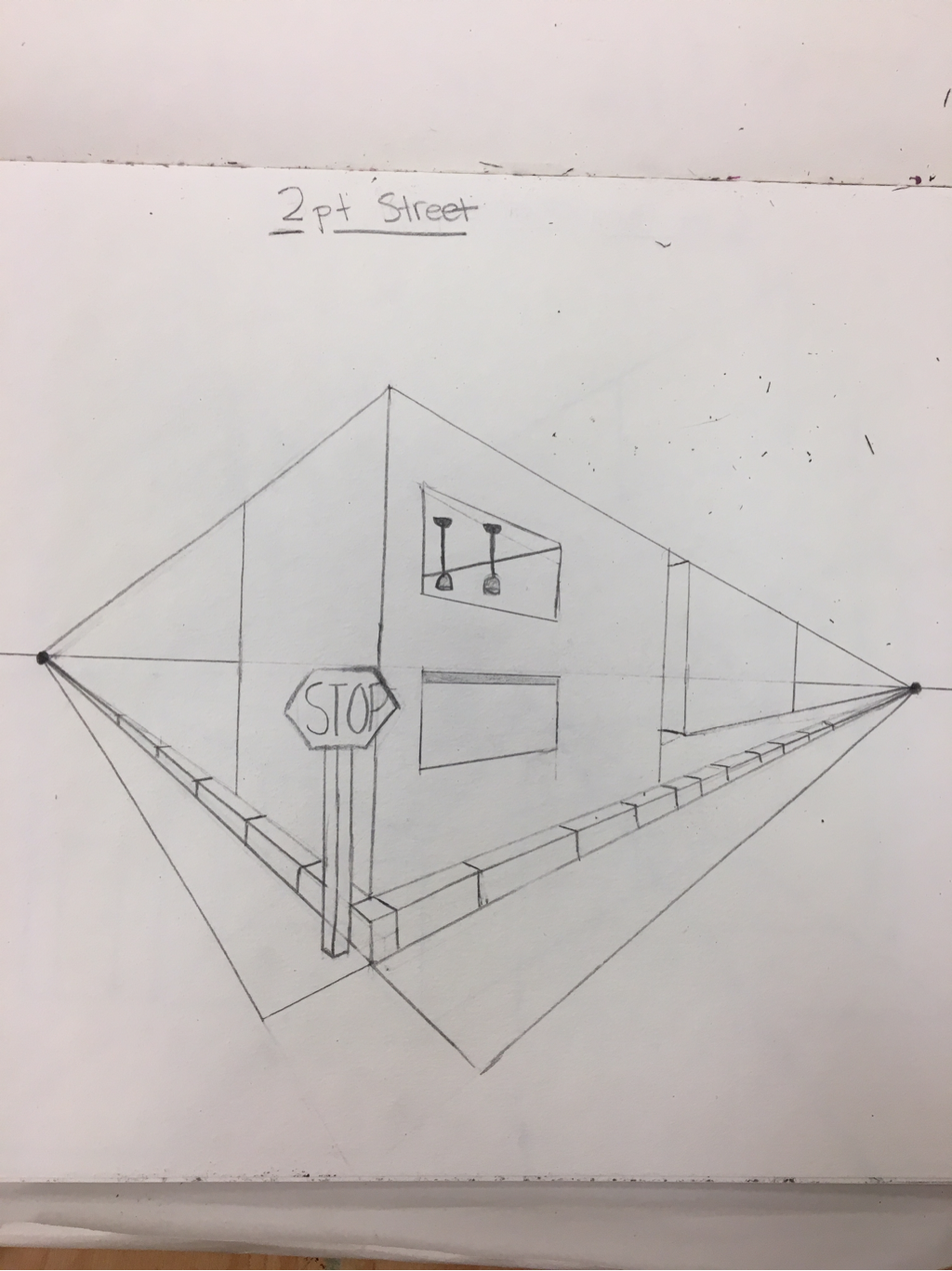 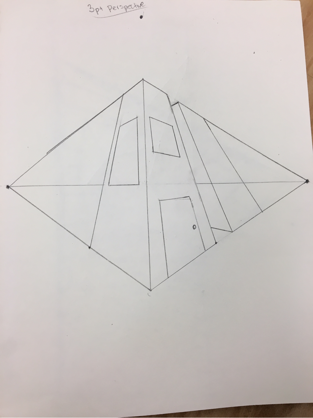 These are my practice perspective pages. I enjoyed 3 point perspective because it gave the city a very cartoon like feel. I didn't like 1 point perspective because the buildings felt cluttered and compact.
1. Describe the craftsmanship of your drawing. (Is it clear, clean edges, blended well, smudges, defined space, etc.) I think I have clean edges because I used white to highlight the edges of the object to ensure that they would stand out. I might have blended too much because I didn't have many values. I used tortillons to smudge the pencil. 2. Are your values and shadows realistic? How many values did you include? How and why are values important? I think I could've made my values more dynamic. I could have had darker values. I included light and midtone values. Values are important because it makes the piece become more realistic and dynamic. 3. Is there a clear source of lighting? I think so because you can see shadows from the shoe. You also see shadows from the phone. On the bottle you can see highlights which shows that light was shining on the glass. 4. How important were the compositional sketches? Explain. The compositional sketches are important because it gives you and idea of what your completed project will look like. This way you don't commit to one composition. You have multiple actions. 5. How is your final drawing successful? I think my final drawing is successful because I was able to fit little details in the wine bottle and the shoe. I was able to try out new techniques too. I never have drawn lace before and I had to for the hat. 6. Are the proportions, structure and perspective of the subject correct? I think the proportions are correct because of the shoe and phone. The shoe is smaller because it is in the back. The phone is bigger because it is up close. 7. Does the placement & grouping of objects create a pleasing arrangement (composition)? I think the composition is pleasing. The piece isn't cluttered with many items. My piece isn't too busy. I have enough items to fill up the space. 8. Is there a center of interest and is it well located? The center of interest is the phone. I think it was well located because it stands out due to its size. Your eye is drawn to the phone. 9. How well did you manage your time and resources throughout the process of creating this drawing? Do you see where you could improve in this area? I could've managed my time and patience better. I kept getting impatient with how long and tedious this piece took. I could've improved with the values. 10. What challenges did you encounter during this project and how did you overcome them? I was challenged with drawing the lace in the hat because there was so many details. I compromised and only drew a few details. I challenged with the bottle proportions but kept practicing to get the perfect shape. 11. What have you learned drawing a still life? I learned that I need to be more patient while working with pieces. I learned to focus on the little details of objects. I learned how to pay attention more to focus and composition. 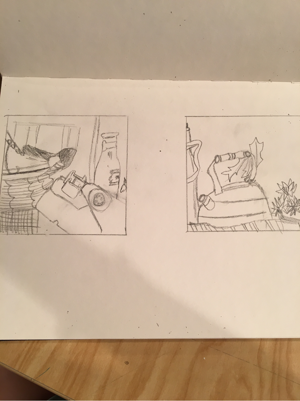 I chose the compositional sketch on the left because it included more objects to draw. I also wanted to incorporate the phone in my piece. 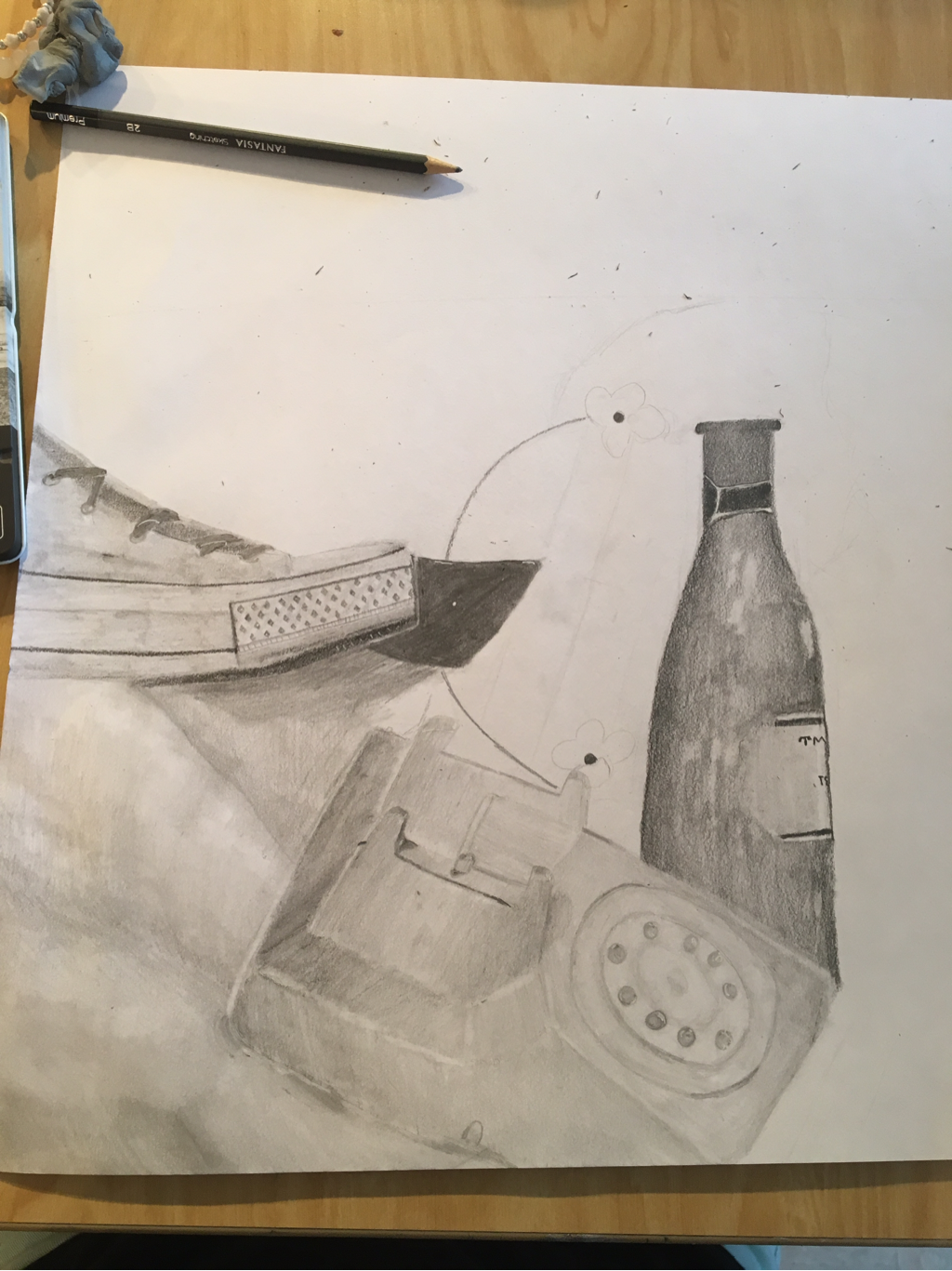 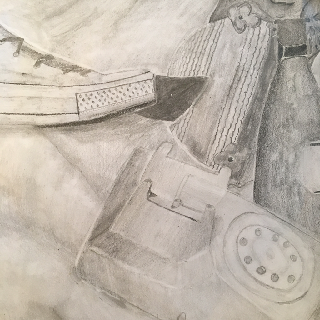 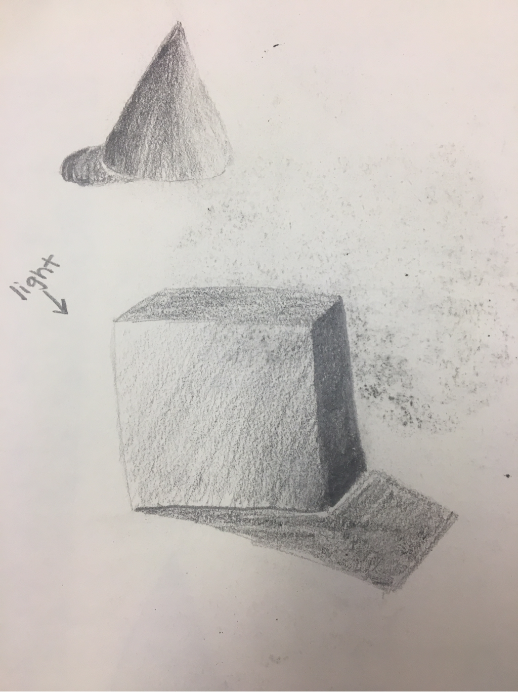 I enjoyed using my pencils for the value drawings of objects. I think I used a wide range of values in the cubes. Below is my homework where I drew a mug, ball and box. I like the shadow on the mug because I think I did a good job curving the mug. 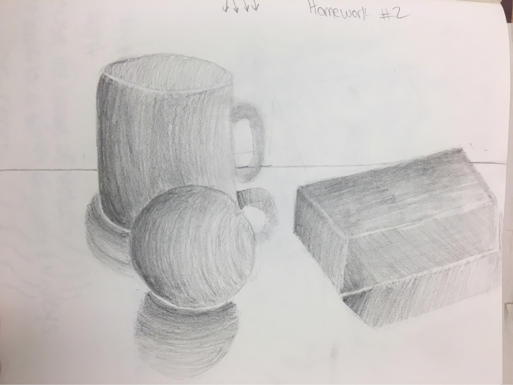 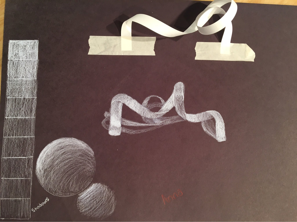 I enjoyed using white prisma color on the ribbon. I like how my ribbon this bed out because it looks 3D. I think I should've made the shadow lighter.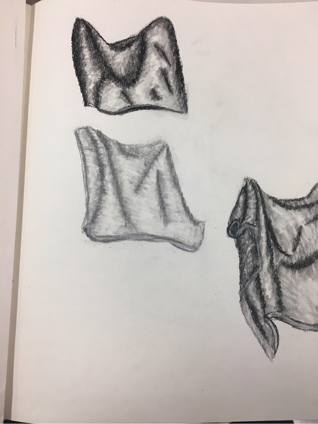 I liked using the charcoal pencils better than the vine charcoal because it is easier to control. The vine is the middle fabric in the photo above, the pencil is everything else. At first I liked my fabric drawings, but now I realize I could have added more values. 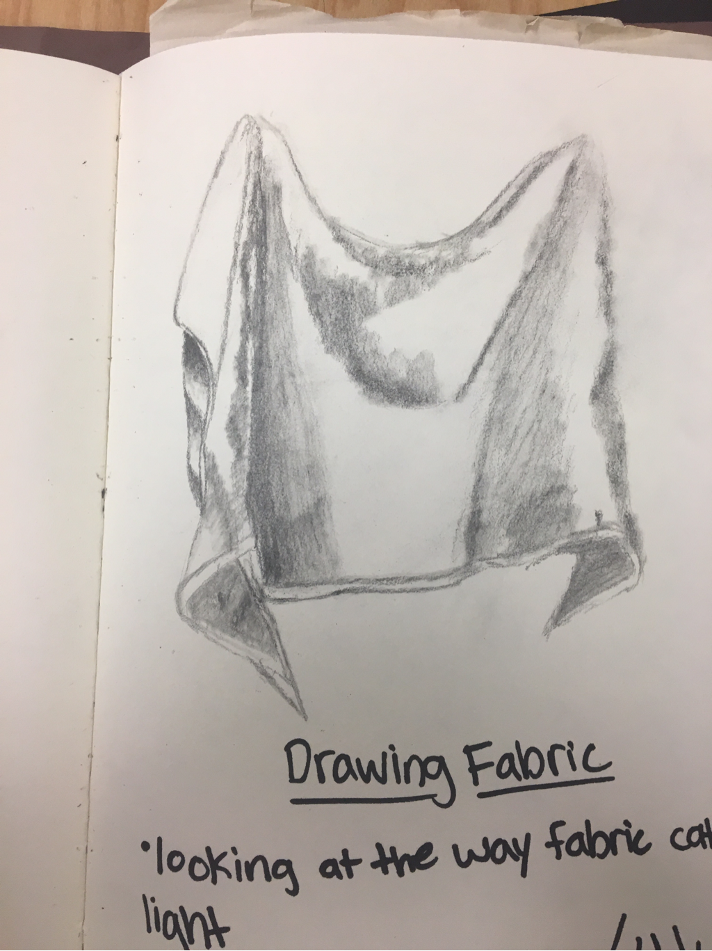 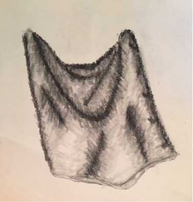 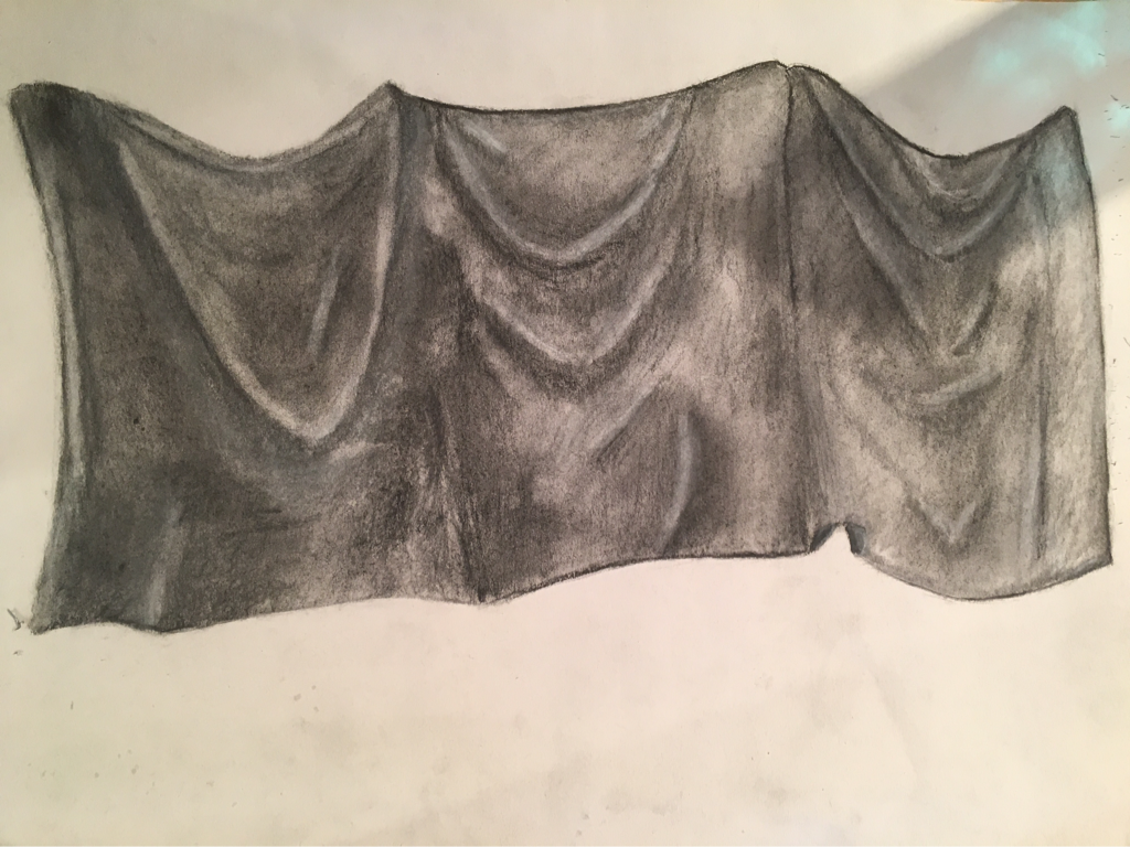 1. Did you use a wide range of values? (A range from white to black with at least 9 values). Explain how is this evident? I tried to use a wide wange of values, but I still need to work on that. You can see a variation of value leaving the highlights. I mainly used the darker values on my fabric. 2. Explain how your knowledge and creating practice studies with value contributed to your piece. Creating value charts helped me to make a wider variation of values. Drawing shapes helped me see where to look for when placing highlights. The practice drawings with the fabric helped me decide where I would look at on the fabric to draw. 3. Describe the blending and transitions in your fabric (discuss your use of pressure with pencil/colored pencil/charcoal pencil and other techniques to achieve this). I went hard pressure to light pressure when leaving the highlights. I used a tortillion to help me blend my values. I also used my finger to make a softer change in values. 4. Explain how your interpretation of texture is essential in capturing the look of the object. My interpretation of texture when drawing fabric is to make it smooth and gentle looking. The fabric didn't have any rough looking areas. The fabric was smooth besides the light wrinkles within. 6. If you could recreate your pieces what would you do differently to enhance the final outcome? I would make the values lighter and make a more drastic change between values. I would work on making my fabric bigger in size. I would try to make the highlight more defined. 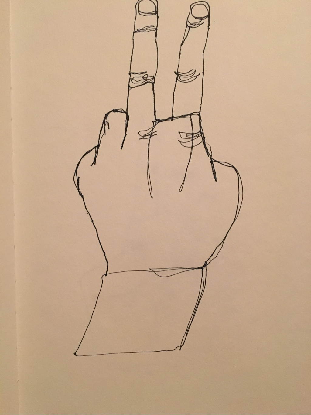 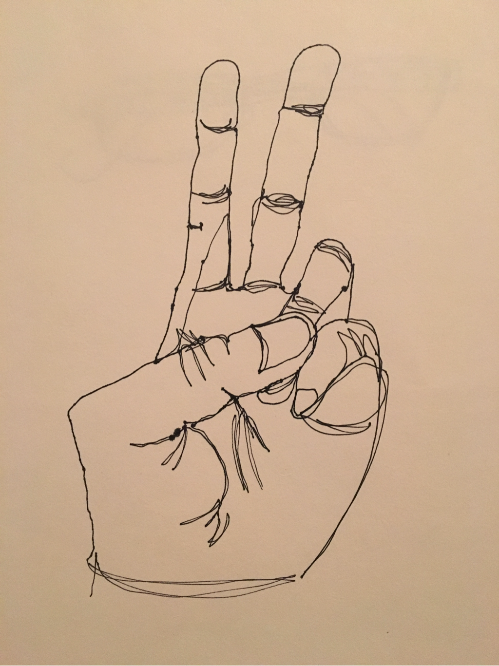 These are my two favorite modified contour hand drawings. I need to work on proportions still because the fingers are a little wonky. I like how these turned out because I added more detail within the hand which was something I struggled with doing. I tried to incorporate all the details on my hand that I could see.
|
Anna Johnson
Archives
January 2017
Categories |
 RSS Feed
